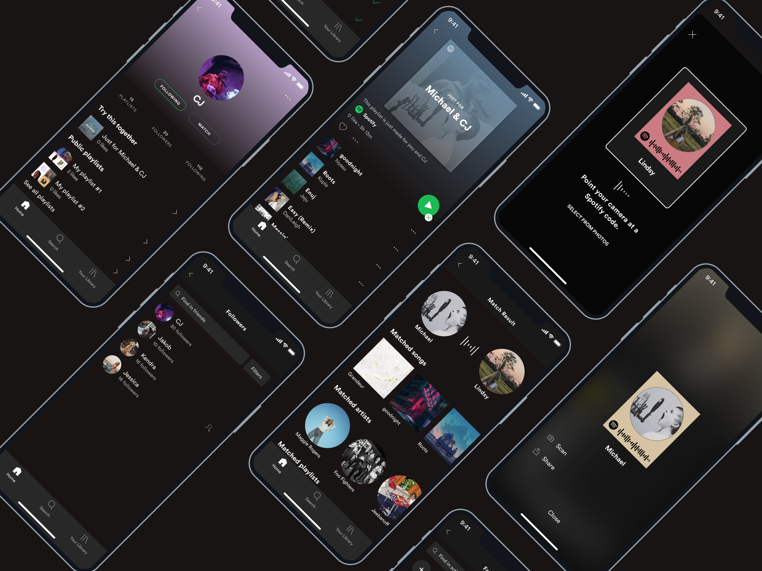
Bringing people together who has similar musical taste.
Spotify • 2020 (Concept) • Solo project
Client: Spotify (Fictional client project)
Platform: Native App (iOS)
Role:
UX, UI Design, UX Research
This project is only focused on Design without development.
Solo project
Timeframe:
2 weeks (Within 80 hours)
Tools used:
Figma, iPad & Apple pencil, Zoom
Project Brief
Spotify’s mission is clear: “to help people listen to whatever music, whenever, wherever they want — in a completely legal and accessible way.” As a streaming music service, Spotify is the group leader and it wants to stay that way.
Challenge
Integrating a new social feature that embeds within the current Spotify mobile app.
Encourage users to interact with each other through music.
Step1: Understand the problem
Learn about the music streaming industry
First, I conducted market research to understand the demographics, and trends of the online music streaming industry.
Demographics
Spotify
The most popular channel with under 30s.
29% of users are Millennials.
56% of users are male.
Music streaming market
35.9% of users are 25-34 years old.
55.5% of users are male.
40.6% of users are in the low-income group.
Usage
Finding Music
Music streamers mostly find new music through the “Similar Artists” section.
Streamers are continuously listening to the same kind of music.
People are choosing to listen to similar genre playlists to find various singles rather than a full album.
Trends
Personalized playlist
Today’s music listeners expect highly advanced personalization when using streaming services.
Music listeners find the playlists easier to navigate based on their tastes.
Device
52% of users listen to Spotify songs from their smartphones.
There is increased use of smart speakers amongst music streamers.
The most popular devices to the listeners are those that can have with them while traveling or outside the home.
Competitive Analysis
I conducted a competitive analysis to compare the competitor’s strengths and weaknesses. From this research, I could identify opportunities for Spotify to differentiate itself from a social feature.
User Interview
Based on the demographic information from market research, I recruited six participants from my user interview.
Interview Summary
🎧 Participants: who have been using Spotify regularly.
⏱ Average interview duration: 15 minutes.
👥 Demography: 3 males and 3 females, 29 to 34 years old.
View the user interview guide here.
Empathy Map
I created an empathy map to synthesize the findings from the interviews. I used this tool to uncover users’ insights to define their needs.
💡 Insights
People listen to music in several situations.
People like to be recommended music that they like.
People want to meet people who have the same music tastes.
👀 Needs
People need to know what to listen to based on their situation.
People need to know new music that is similar to what they already like.
People need to know who likes what they like.

“ I don’t share the music because my taste usually doesn’t match others’ tastes.”
- One of my interview participant
Target User — Who is this for?
Millennial Music Lover
Pain points
Hard to find what he wants easily.
Music suggestions aren’t always accurate.
Hard to meet people who like the same music.
Needs
Know what to listen to based on the situation.
Find new music that is similar to what he already likes.
Know who likes what he likes.
Brand Affiliations
Soundcloud
Reddit
Our persona (let’s call him “Michael”) is always listening to music. He is constantly looking for new music. His tastes in music are a bit unique and specific.
Step2: Brainstorming
Define problem
After defining my target user, I created POV statements and “How might we” questions to see the problem that I need to solve from the user’s point of view.
🧠 Brainstorming 🧠
Using HMW questions I began brainstorming many solutions to meet Michael’s needs. I generated as many solutions as possible with short brainstorming by myself, 3 minutes 2-3 rounds.
To get some fresh input, I moderated a group brainstorming session with five participants. They are all Spotify users and are in the target user demographics.
👀 View the detail about the group session here.
🧠 Group Brainstorming Workshop 🧠
Prioritize the ideas
I picked the features among the brainstorming ideas that meet the user’s needs. The function I choose is that shows how similar music tastes between a user and his friend. I created a product feature list and prioritize it according to effort and importance.
👀 View the entire feature list here.
Task Flow
I created a task flow to demonstrate how users would navigate the new feature on the mobile app to achieve the main tasks.
Main tasks
Checking the similarity between the user and his friend’s musical tastes.
Seeing the music suggestions for them.
Application Map
I created an application map to outline the relationship between new features and existing features.
Step3: Design
Wireframes
I simply drew multiple key screens of the new feature. This helped me to generate ideas for layouts and organizing content. These layouts were created based on the existing design patterns of Spotify’s mobile app.
Design mockups
After drawing some sketches, I digitized the wireframes. All the UI elements were arranged by the existing design system so that the new feature was integrated seamlessly.
Clickable Prototype
With the high-fidelity mockups, I made an interactive prototype using Figma to provide to users during the usability testing.
Scenario 01
You met a new friend, Lindsy, at a party. You found out you both like music so now you want to know how similar you and your new friend’s musical taste is.
Follow your friend by scanning her Spotify code.
See the similarity of you and your friend’s musical tastes.
Check the musical taste
Scenario 02
You and your friend ‘CJ’ are going to play a video game together. You want to know what to listen to that both of you will like to listen to.
See the music suggestions for you and your friend.
Discover music with your friend
Step4: Test with users
Test with users
Usability Testing
Test Overview
In-person and online.
Participants verbalize their thoughts as they interact with the prototype while they work.
I observe participants’ behavior to uncover any confusion and errors.
Participants
2 Males, 3 Females, 27 to 34 years old.
Average test duration: 5 minutes
All participants use Spotify regularly.
Affinity Map
With all of the notes I took during the test, I synthesized test findings using an affinity map to uncover any design improvements. This allowed me to get insights and recommendations which can be used on the next iteration to improve the current prototype.
💡 Insights
Scan: In the current design it is hard to find the scan button.
‘See All’ button: Users think the ‘See All’ button is the follow friend button.
Friends list: Users don’t think that the list is a subcategory of your library tab.
Match result: Users are confused about the relationship between the matching result screen and the friend’s profile screen.
‘Try together’ playlist: Users don’t recognize the playlist right away because it’s not noticeable.
Step5: Iterate
Scan: It is hard to find the scan button.
❌ To scan the code, it took multiple steps. (Settings -> View profile -> See more -> Scan)
✅ Place the scan icon on the home screen so that users can easily find it.
2. Confused about ‘See All’ button.
❌ User thought the ‘See All’ button is a ‘follow’ friend button.
✅ Got rid of result text and the ‘See All’ button. Made profile image bigger to easy to touch.
3. Can’t think of the ‘Friend list’ located under the ‘Your library’ tab.
❌ Users don’t match ‘Friend list’ and ‘Library’.
✅ Remove the ‘Friend list’ from your library tab and consolidate friends and following artists in the following list in the existing profile screen.
4. User didn’t expect to see the ‘match result’ when they scan the friend’s code.
❌ Show the match result screen after the user scans the code.
✅ Show the friend’s profile screen right away when the user scans the code.
5. ‘Try together’ playlist is not noticable.
❌ ‘Try together’ playlist is placed under friends’ public playlists on the profile screen.
✅ Replace the ‘Try together’ playlist at the top of the list.
Final Design
With a set of priority revisions, I updated my previous mockups and created a final version of the high-fidelity prototype. Another round of user testing and revisioning can be conducted using this prototype before going further with the implementation.

Reflection
🧐 What did I learn?
For designing new screens, the existing design pattern had to be thoroughly analyzed in to embed into the existing app seamlessly.
It was necessary to check how Spotify has been changing its design. I learned that it is important to know the history of the product.
🤔 If I had more time…
More iterations to improve the product
With the updated prototype, I would like to validate the improvement through another round of usability testing.
Design in different platform
With the tight timeline of the project, I could only focus on designing for the iOS mobile app. I’d like to make an Android version for the new feature as well.


